


Vintage and maximalist lovers, this one’s for you! Just kidding it’s for everyone because this house is pure design joy. Pattern, color, whimsy, the gang’s all here. I think it’s safe to say this home is filled with about 90% vintage and leans into color in a really fun but intentional way. Your eye is both excited yet not overwhelmed. This takes a lot of skill which the new HGTV designer of Fix My Flip, Francesca Grace, clearly has. She also made a pretty cool unexpected design choice in this 2-bedroom, 1-bathroom, 1100-square-foot Craftsman-style home that I can’t wait to show you…among all the other things I want to show so let’s dig in.
Every designer has a unique way of attempting different styles, so I needed to get her top tips on how to go maximalist:
“Don’t be afraid to mix different eras together. Whether it’s vintage, midcentury, a little bit of country chic, whatever your favorites are, throw them all together and I’m certain you’ll love the outcome, because everything in your space should speak to you. You’ll be surprised how well mixing different pieces together balances each other out, and if you don’t know already, balance is key. If one end of the room has a lot going on, don’t leave the other half bare. Plants are another great way to balance out your space.”
Much like Emily says, “pretty looks good next to pretty”. Mixing all sorts of vintage from different eras, as long as the materials and colors talk to each other, is a super-easy way to inject your home with a lot of *your* personality.

Here is Francesca’s awesome living room. The color pallet is fairly neutral with golds, corals, and whites from this angle (and dare I say a hint of chartreuse?). The colors keep it all cohesive while the actual pieces are everything from MCM, trendy 2022, victorian, etc. Also, each piece also has a fair amount of pattern and/or texture:)
See how the flowers on that Tiffany lamp match the color of the club chairs but speak to the pattern of the sofa on the other side of the room? That’s an example of visual balance.

Paint Color | Vintage Fringed Chair (similar) | Benni Ourain Checkered Rug
But then SUPRISE! There’s a dark teal accent wall that makes the room feel a bit more grounded as well as helps to tie in the other end of the room, the dining room.
Francesca is a clear color lover so I asked if she had a color palette philosophy:
“I would simply say to not be afraid of any color! Every hue can work in a space so long as you use it in the right way and with the right design choices. If you want to achieve a comfortable and restful aesthetic, as if you’re in a cabin surrounded by trees, go darker with your color choices to create a warmer and welcoming environment. If you’re someone who thrives in a city environment, try lighter and brighter colors to mimic the high-energy of the concrete jungle. You want to ensure your color choices match what you feel, or how you want to feel when you’re at home.”

Again the color palette is airtight! The wallpaper speaks to the pinks and florals of the living room and those hits of teal flowers tie in the accent wall. Speaking of the HOT TOPIC of accent walls, I asked Francesca, “do you have any rules about accent walls?” since she has a few of them in her home:
“Yes, don’t leave them white! They are the playground, the epicenter, the biggest statement that could be. Yes, art can help a white wall, but an accent wall should be covered with either your favorite color, or wallpaper. The accent wall is ‘where the party is’. Don’t be afraid to bring the party.”
So there are just a few white walls in her home but they feel intentional so that the whole room has a bit of visual breathing room. I really love that she kept the window wall white. First off, it has all of those beautiful widows to show off, and second, I think it highlights the other lighter tones in the room. That’s why it’s both bold and very maximalist yet easy on the eyes and not too overpowering.
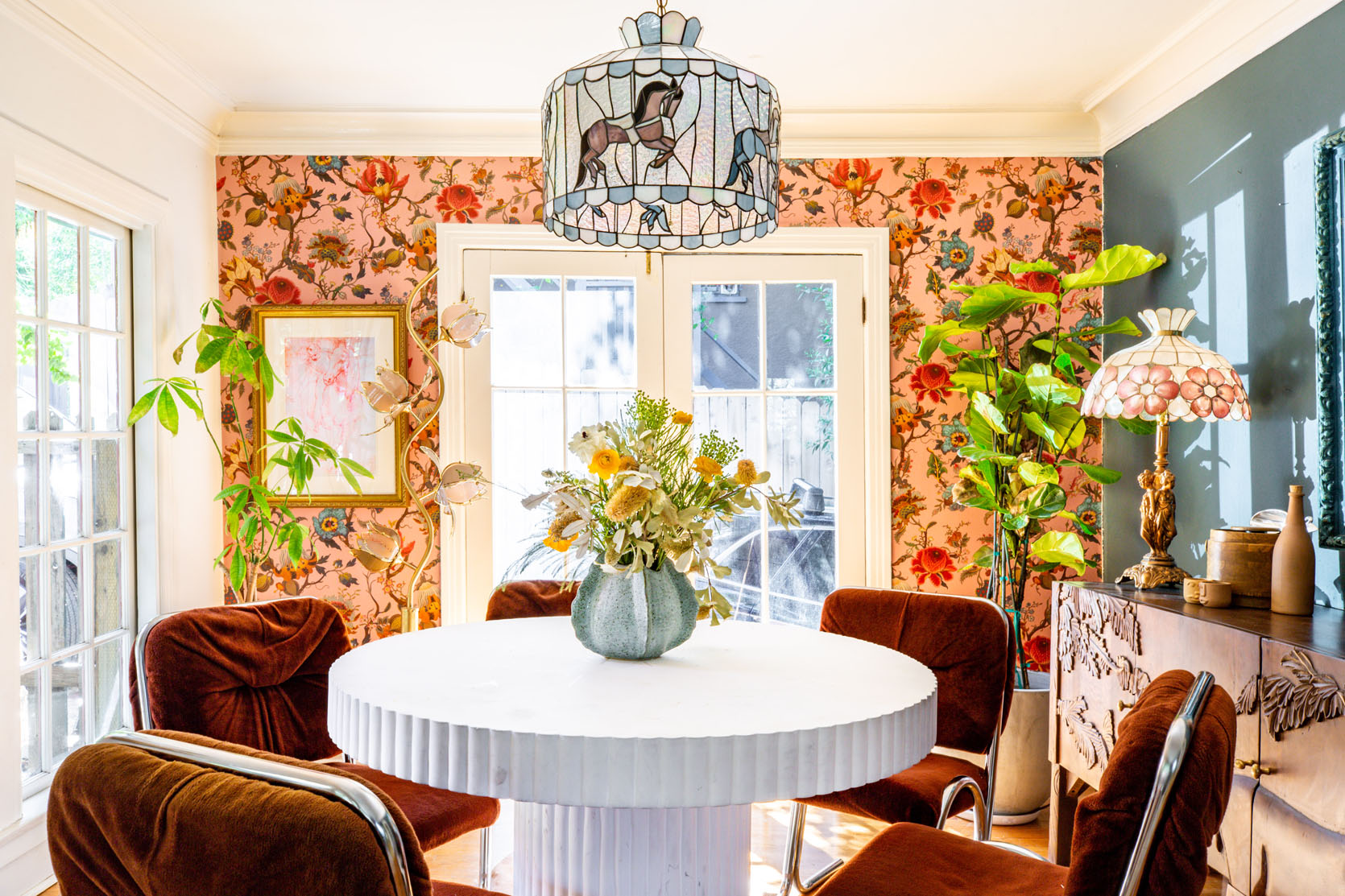
Wallpaper | Vintage Floral Floor Lamp | Dining Table
When I asked her what were her favorite “unexpected” design choices she made in this house? Her second response was this:
“My second unexpected, yet magical, design choice I made was placing a vintage Tiffany pendant that has carousel horses surrounding it in my dining room. People may think it’s childish, but I think it resembles my personality and makes the room completely stand out.”
I think it’s so fun and special. But I’m pretty in love with it all. I also really like how this side of the room is more modern vintage and the living area is more “antique” vintage. However, it all just works because of the color palette and materials.

That credenza is so sweet and beautifully contrasts the modern table and chairs. Plus notice how the frame is tonal with the wall. What’s cool, if you scroll back up to the photo of the entire wall, is that it looks like she very intentionally chose all gold or metallic frames for the living room and then chose this blue one to act as a zone signifier. What I mean is that our blue-framed blonde beauty “tells” you that you’re in a “different room”. Simple and smart:)

Wallpaper | Bistro Table | Rug
Ok, this kitchen is so sweet and pretty. Again, mixing lots of different eras/styles all the while choosing colors in these pieces that would speak to the neighboring rooms (she didn’t tell me this but I feel pretty confident it’s the reason:)). For example, in this shot, she picked wallpaper and chairs with red them to talk to the red on the wall in her bedroom.


How awesome are those art deco chairs that are upholstered in a sweet, small-scale floral fabric that works perfectly with the medium-scale floral wallpaper?
But let’s get into the bedroom and what about it was the most unexpected design choice she made…

Wallpaper | Headboard | Rug | Nightstands (she took off the legs:))
“Turning the so-called ‘Family Room’ into my dream primary bedroom is my favorite unexpected design choice. I always wanted a grand bedroom, and I didn’t want the small guest bedroom to be the primary bedroom. I figured, why not take over the largest room in the house.”
This is what we mean when we say “it’s your home, live in it how it best works for you”. Just because this room was labeled as a family room does not mean it needed to stay that way. Plus look how fun and beautiful it looks. That wallpaper that speaks to the pillows. The pillow color that speaks to the lamps and the nightstands. The pattern play. The headboard. The STAINED GLASS WINDOWS. Naturally, I had to ask specifically about the windows and if they are original:
“This is a mystery I have yet to solve. When I moved in, they were already existing. But they do not feel old enough to have been there since the 20s. I have looked everywhere on the web to try and figure it out, but I have had no luck.”
EHD Readers! If anyone has any theories, leave them in the comments.

I know you see that white wall but it’s the only white wall in the space which again I think was chosen likely for balance and airiness. Plus it has that very cool huge mirror so it doesn’t really clock as a plain white wall. Also…that bench is incredible.

Wall Mural | Coffee Table (similar)
There is also so much I love about the lounge side of her grand primary bedroom. But my favorite part is the two-toned painted trim. So simple, but adds so much visually. This is something I would absolutely do in my bedroom. I also love this huge mirror too. It’s ornate and awesome so it works beautifully with a vintage, maximalist style while making the room feel lighter (and bigger). Lastly, I want you to note the cowhide. It’s a great contrast in shape to the grid rug (which I also love). Another rectangle would have looked odd. Also, it helps to visually break up the coffee table and wood floors since they have similar tones. The dresser is also in that medium wood tone family but since the light-toned hide is there it moves your focus.

Wallpaper | Headboard | Lamp Base
I know this shot is a bit of a tease since it’s the only one we got for the guest room, but how incredible is that lamp and wallpaper combo? Fringed lampshades are trending and I’m not mad about it. I actually found one for my friend’s room makeover at an antique mall. I love the romantic vibes of the bed, nightstand, and lamp contrasting with the more pop floral wallpaper. It just looks exciting and is a very fun bedroom for a guest.
We’ve obviously seen many vintage finds in this house so I asked for her hot thrifting tips:
“Travel outside of a main city, if you can. Usually, the best finds are off the beaten path. When you go, don’t hold back – dig! The treasures are often hiding, so bring gloves if you’re afraid of getting dirty. Also, get creative with your finds. For example, old hardware can make for a cool key holder or towel holder in your bathroom. Think outside the box.”

Lastly, we have her sweet bathroom. I love that she still went bold with pattern but kept the colors very calming. Her version of an eclectic, vintage mini spa. Also, take note of that very cute towel hook!
As someone who has been known to take her time designing, I wanted to see how long it took to fully design this special home that is so personal to her:
“I have been in the house for nearly 2 years. And every day I create a new project for myself so I would say, it is still a work in progress. The overall furnishings were completed within the first year of moving in. I definitely had to be motivated to fully finish the wallpapering and painting, and to finally furnish both the front and back yards. I must say, it’s feeling close to done! My design style is a work in progress and is constantly evolving to reflect my mood.”
Well, maybe that’s the trick! Every day a little house project. Maybe we could do like month challenge and see how much progress we make?! Just throwing out ideas:) Anyway, it was so fun to see Francesca’s home and I can’t wait to check out her show!
Love you, mean it.
*Design by Francesca Grace
**Photos by Marisa Vitale
The post HGTV Designer, Francesca Grace, Made A Pretty Uncommon Design Choice… Wanna See What It Is And If You Would Do The Same?? appeared first on Emily Henderson.